From deadly Mediterranean migration routes to Russia’s battlefield resurgence and Spain’s worsening wildfire crisis, this edition of our Top 10 in Data Journalism highlights the most compelling global stories told through numbers, visuals, and interactive reporting.
Putin’s Military Momentum in Ukraine
Russia is regaining battlefield strength as Vladimir Putin pushes for peace talks on his own terms. An interactive analysis by The New York Times shows how Russia’s renewed offensive is fueled by enlistment bonuses, rising weapons production, and modernized Soviet-era bombs.
Drawing from data in Tatarstan — a region with some of the highest recruitment rates — the piece highlights how Moscow is adapting after early missteps. Incursion maps and drone footage illustrate Russia’s evolving tactics, suggesting Putin now holds the upper hand in negotiations.
Deadly Mediterranean Migration Routes
Italy claims its migration policies are working as irregular arrivals decline. Prime Minister Giorgia Meloni and the European Commission credit deterrence measures for reduced crossings.
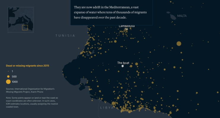
Yet, Reuters Graphics challenges this narrative with stark data: 3,812 deaths or disappearances in 2024–25, nearly half along the central Mediterranean route. Alarm Phone logged over 1,300 distress calls, revealing how restrictive policies limit rescues.
Through satellite images, ocean analysis, and vessel tracking, Reuters reconstructs one doomed voyage from Libya, showing that so-called “success” has come at the cost of human lives.
Gambling Dominates Premier League Jerseys
As the Premier League returns, Bloomberg Graphics explores three decades of shirt sponsorship. Early deals favored tech and telecom firms like Hewlett-Packard (Tottenham) and Brother (Manchester City).
Today, more than half of clubs feature gambling brands on their kits. A striking streamgraph reveals how betting companies have taken over sponsorships — transforming football shirts into global advertising billboards.
Trump’s Tariffs Hit Switzerland Hard
Switzerland faces one of the highest US tariffs under President Donald Trump’s trade policies, set at 39%. Le Temps shows how volatile gold exports artificially inflated Switzerland’s trade surplus with the US, triggering harsh tariffs.
The analysis highlights flaws in Trump’s tariff logic, where economic swings drive inconsistent policies, leaving Switzerland at a disadvantage compared to other trade-surplus nations.
Spain’s Wildfires Burning Longer
Spain is battling increasingly destructive wildfires, with thousands of hectares lost. Diario Sur analyzed decades of General Forest Fire Statistics (EGIF) data and found fires are not only larger — they also last longer.
Experts attribute this to climate change, prolonged droughts, and the decline of traditional land practices. Known as the “fire paradox,” suppressing smaller fires has fueled conditions for larger, deadlier blazes.
Other Global Highlights
- Japan Airlines Disaster, 40 Years On – Nikkei reconstructs the 1985 crash of JAL Flight 123 with detailed timelines and animations.
- Nigeria’s Local Funds Falter – Dataphyte finds billions in local government allocations remain underutilized despite new autonomy.
- Palestinians Under Fire – A Guardian investigation documents Israeli gunfire targeting food aid seekers in Gaza.
- US Airstrikes on Iran – The New York Times analyzes bunker-busting bomb impacts on Iran’s Fordo nuclear facility.
- Namibia’s Colonial Legacy – Forensic Architecture traces ecological scars of German colonization.
- Tribute to Ozzy Osbourne – The South China Morning Post honors the late Black Sabbath frontman with data-driven visuals of his career and legacy.
Conclusion
This edition underscores the power of data journalism in revealing hidden truths. From Mediterranean migration deaths to Putin’s military resurgence, gambling’s dominance in football, and Spain’s enduring wildfire crisis, each story uses data to bring urgent global issues into focus.

